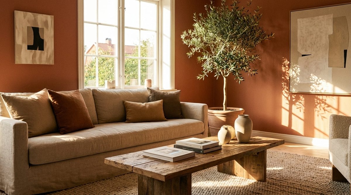
Spring is here. The urge to lighten up and air out our interiors is hitting hard right now. We spent the winter huddled in spaces heavy with warm colors. Those hues kept the atmosphere cozy. Now, it is time for renewal. It is time for lightness.
A fascinating shift is underway in interior design for 2026. A specific shade, inspired by the ocean depths, is disrupting established codes. It is replacing the warm decor that used to reign in every living room. The goal is a more serene, natural, and balanced living space. This is not just a trend. It is a lifestyle shift toward calm.
Leaving Behind the Warm South
The current decor trends mark a genuine break from the enveloping tones that dominated previous months. The main objective is to invite clarity and fluidity into the heart of living spaces. Instead of overloading rooms, the current approach favors a visual rebirth. We are looking for delicate, luminous shades. These are ideal for reinventing interiors that are always in motion.
The End of Terracotta and Earth Tones
For a long time, terracotta, ochre, and various mineral browns warmed up dining rooms. They created reassuring cocoons. These earthy tones formed the base of authentic decoration with southern accents. They felt safe. But enthusiasm for these very warm nuances is fading subtly. Decoration is gradually saying goodbye to cocooning atmospheres. It is making room for a refreshingly cooler approach. This suits the brightness of the new season.
Blue Glacial and Sea Green Take Center Stage
The big secret of this year lies in a completely rethought color palette. It is the cool tones. Specifically, blue glacial and sea green are taking over walls and textiles. Blue is asserting itself as the absolute star color of home furnishing. It comes in deep nuances like sky blue, grayish blue, or night blue.
But the must-have of 2026 is Transformative Teal. This captivating blue-green color redraws the space with elegance. Celadon green, when skillfully married with blue, creates a subtle retro atmosphere that is incredibly trendy.
The shift to cool tones is not just about aesthetics. It is about psychological calm and bringing nature indoors.
Diving Into Aquatic Nuances
This new chromatic impulse is intimately linked to the biophilic trend. This is a strong movement that harmoniously brings interior space closer to the surrounding nature. Bringing vegetable and aquatic tones into the habitat offers an immediate benefit of freshness and well-being. It connects us to the outside world while we stay inside.
Using Cool Tones to Calm Busy Interiors
To build a harmonious living space, simple to live in and calming for the whole family, managing color volumes is strategic. The golden rule lies in beautiful proportionality.
Here is how to apply it:
- 60-70% of surfaces: Choose a base of sophisticated neutral tones. Think warm beige or soft natural khaki. This forms the canvas.
- 20-30% of the room: Use a very soothing secondary color. This is where blue glacial or a frank sage green shines. It brings the aquatic theme to life.
- 10% remaining: Distill a more energetic accent. This wakes up the light modestly.
This formula prevents the room from feeling flat. It keeps the energy balanced.
Softening the Palette with Lavender
To ensure this aquatic plunge does not cool down the habitat too much, seductive pastel fog tones come into play. They act as moderators. Touches of soft lavender, faded lavender, or desaturated powdery pink soften the clarity. They offer gentle luminosity. You avoid harsh, bright tones.
This spring awakening also marks the return of radiant pastels. Their power is very elegant. Consider butter yellow, almond green, and soft coral. They reflect daylight in a very advantageous way. These accents keep the space feeling alive and welcoming, rather than sterile.
The transition is real. It is happening now. You can start small. Paint one wall. Change the textiles. See how the light changes. The ocean is coming inside.
Mixing Natural Textures Without Losing Warmth
You don’t need to tear out walls or replace every piece of furniture to change the vibe of your home. Sometimes, a strategic shift in materials does the heavy lifting. This is especially true when your weekend free time is limited.
Raw, heavy textures are out. Refined, translucent layers are in. Think satin-finished light wood, premium linen, and precisely woven raffia. These materials do more than just look good; they enhance soft greens and blues while keeping the space comfortable to live in.
To amplify that airy feeling, introduce semi-transparent glazed ceramics. Use translucent glass in your lighting or window treatments. Textured cotton voile curtains are a practical choice here. They filter harsh sunlight without blocking it entirely.
Furniture should follow this lightweight logic. Choose pieces with tapered, slim legs. This creates a visual illusion of suspension. It makes living rooms feel larger and less cluttered.
“Raffia and satin wood enhance cool tones while maintaining physical comfort.”
The Formula for a Cohesive Coastal Transformation
Success here relies on a minimalist strategy. It is liberating because it removes decision fatigue. You only need three core elements to anchor a look:
- A soft, calming color (think seafoam or deep navy).
- An airy textile (linen or cotton).
- One high-quality natural material (wood, stone, or woven fiber).
Combine these, and you have a base. From there, apply the “subtractive rule.” Remove two old decorative items. Add only one new piece that has high visual weight. This prevents the space from feeling busy.
Lighting is next. Avoid bare, harsh bulbs. Instead, use elongated mirrors to bounce light around the room. Pair them with soft, diffused pendant lights. This creates a gentle glow rather than clinical brightness.
Finalizing Your Refreshed Interior
Inviting blues, celadon greens, and hints of lavender into your living areas transforms the atmosphere. The result is a space that feels sanitized and thoughtfully designed. It is easier to clear your head in such an environment.
These aquatic hues prove that you can lighten your decor without losing character. It is about curation, not accumulation.
Are you ready to let this aquatic wave change your interior? The warm weather is coming. Your space can be ready for it.